Being the primary progression mechanic in our games, the season experience hadn't been wholesomely analyzed for over a whole generation of games. We decided it was time to address this in an update to our latest games.
Gathering feedback internally and from users, it was obvious that the season UX was outdated and felt out of place among the newer and higher fidelity flows in the game. Furthermore, there were major failings in the flow, chiefly it's inability to provide the user with meaningful information and feedback about the season feature.
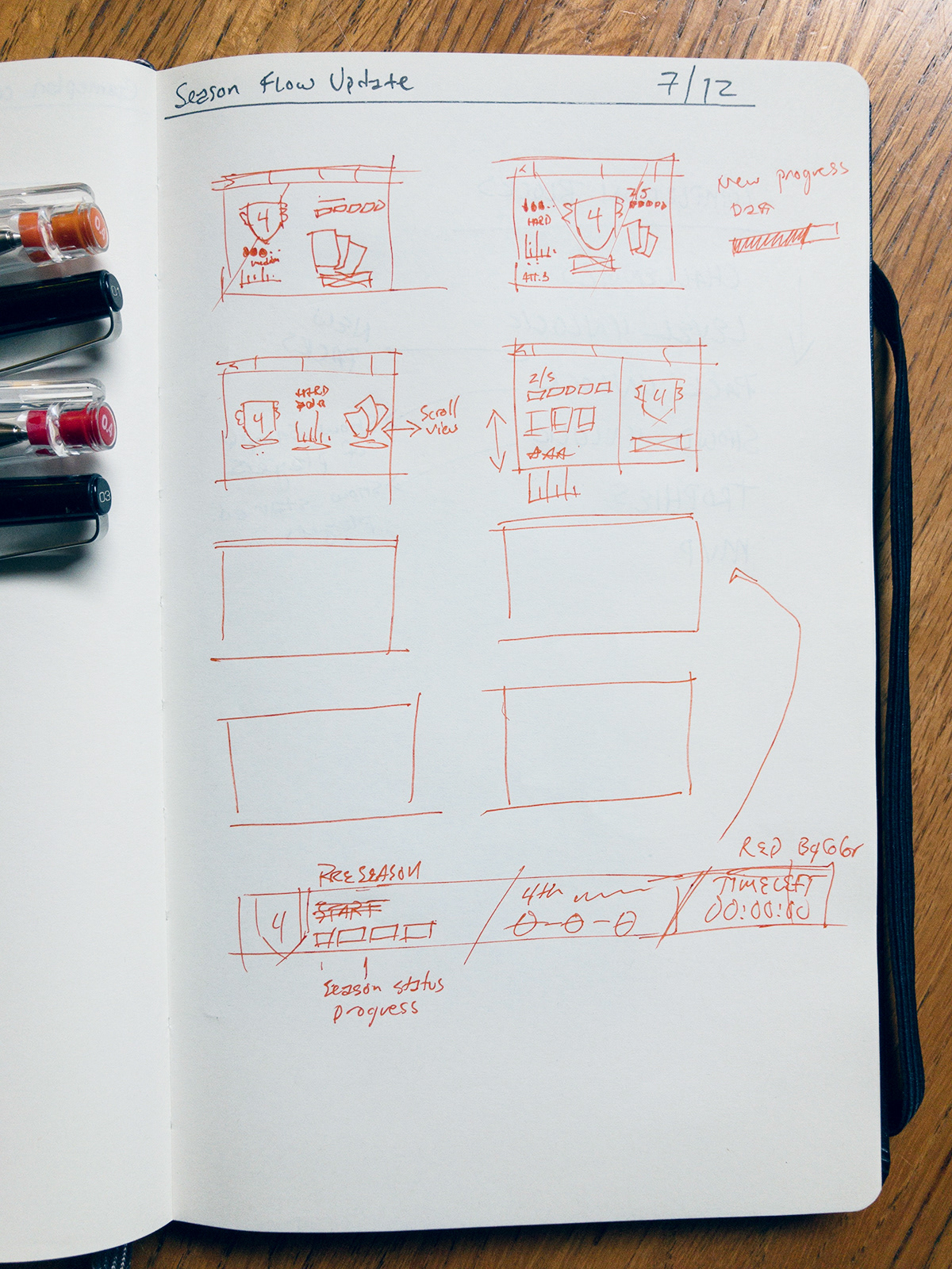
In the effort to be economic, we focused our efforts on the status/landing view as well as the interstitial modals.
Previous season status view
The start season state for the landing view was given a unique layout to bring it forward in the hierarchy. Unlike the previous rendition, the UI now showcases prominently the level difficulty and rewards for completion as well as were they currently stand if they have attempted the level before.
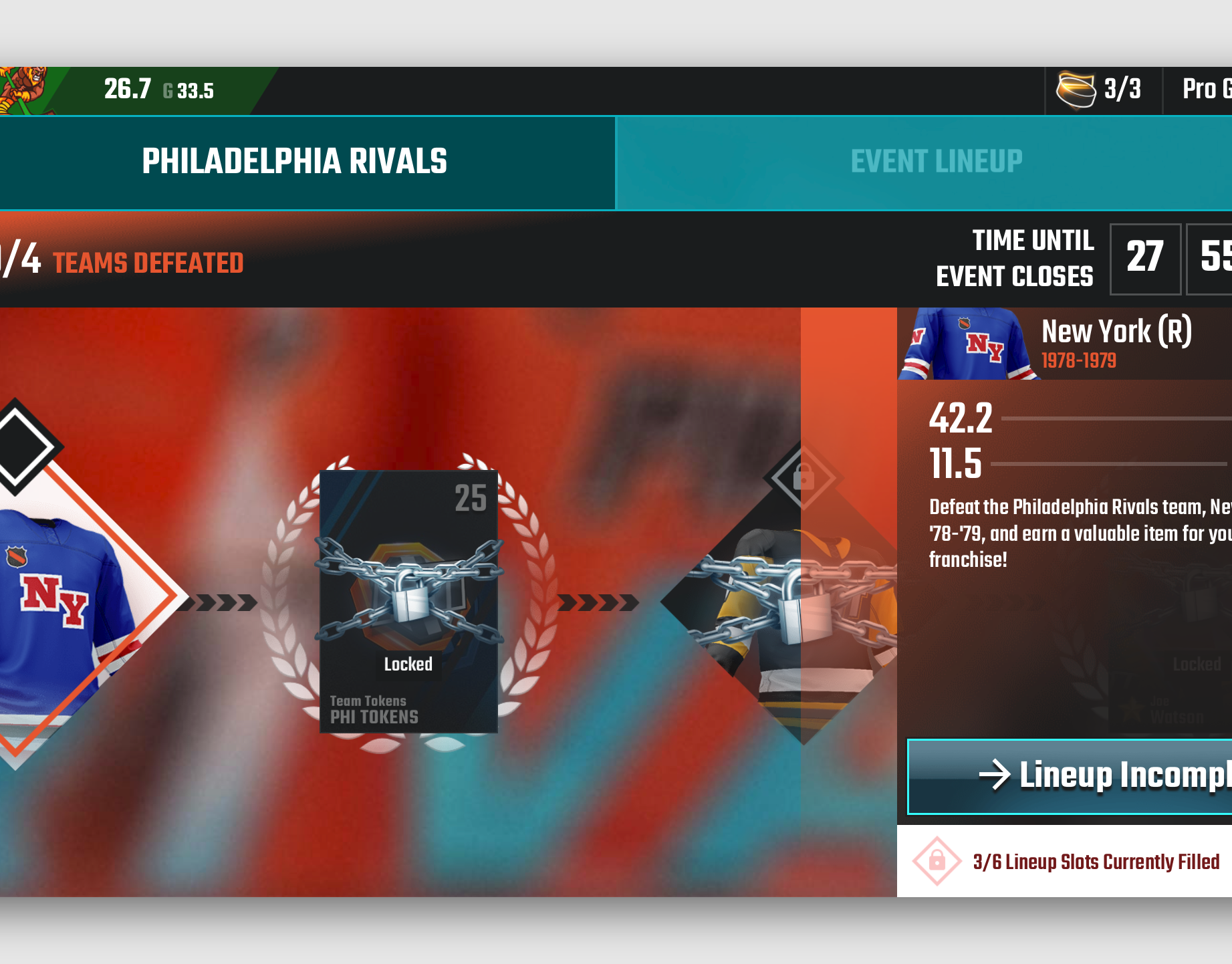
Level tiers which are identified by their unique level icon had their color palette bleed into the UI elements to cement the connection between team levels and the season feature.
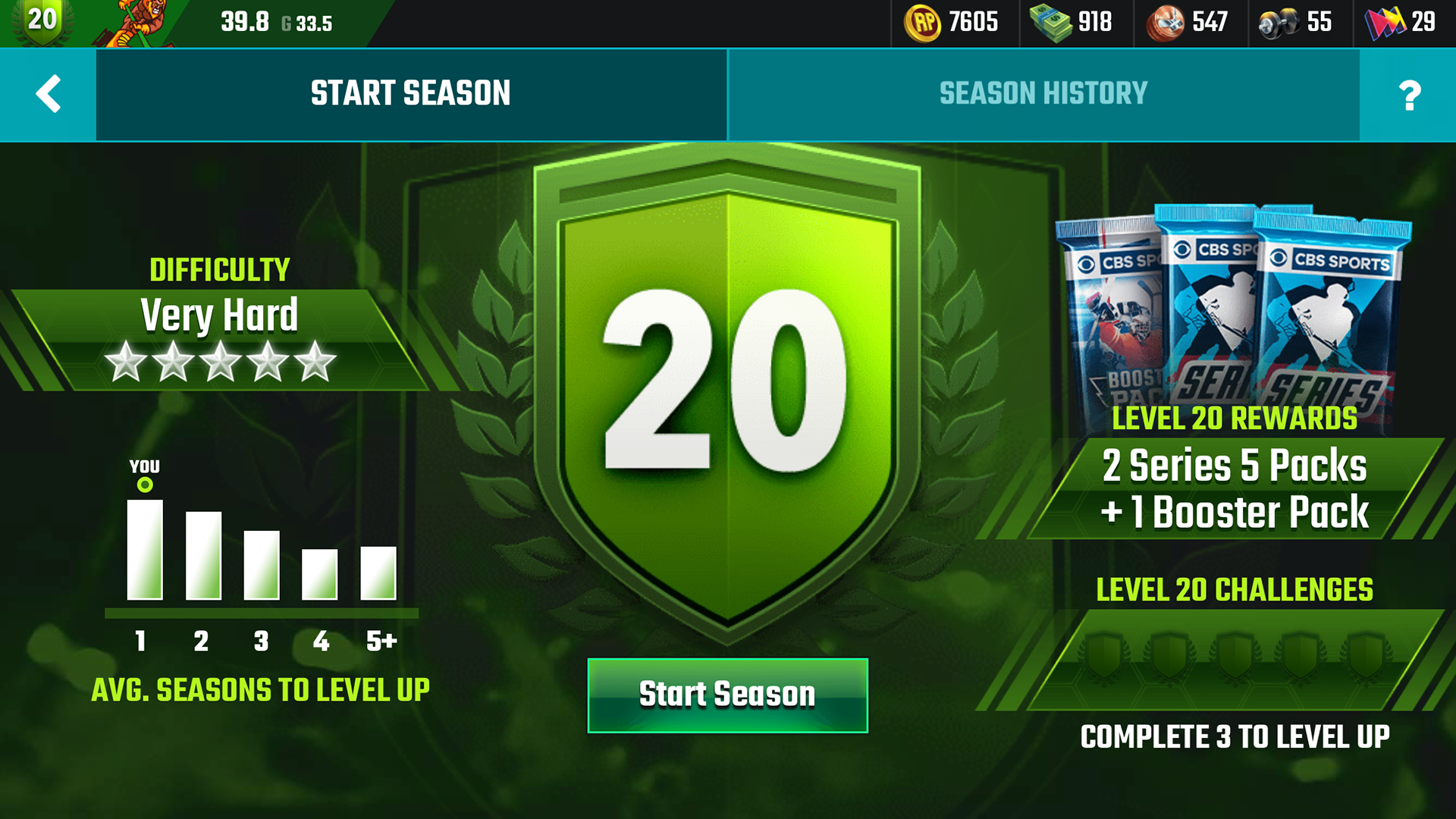

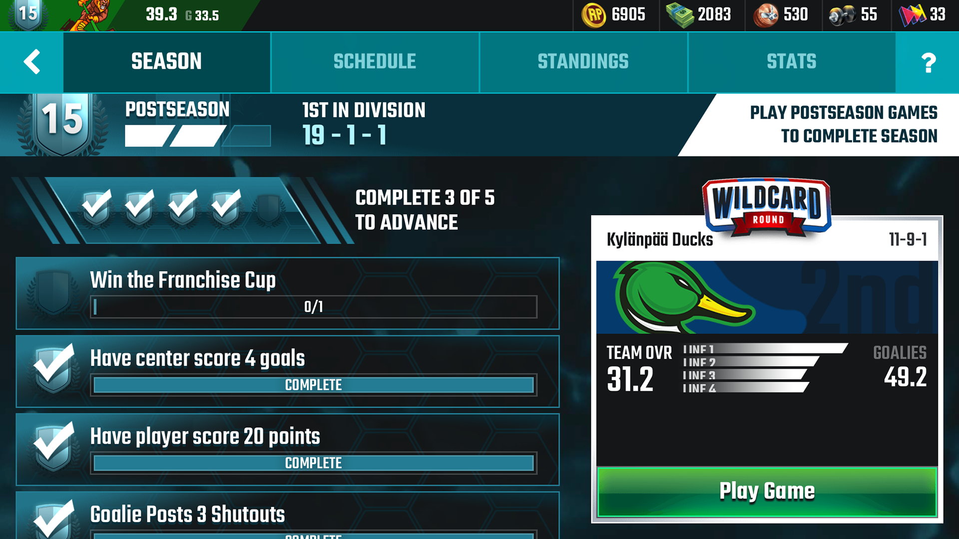
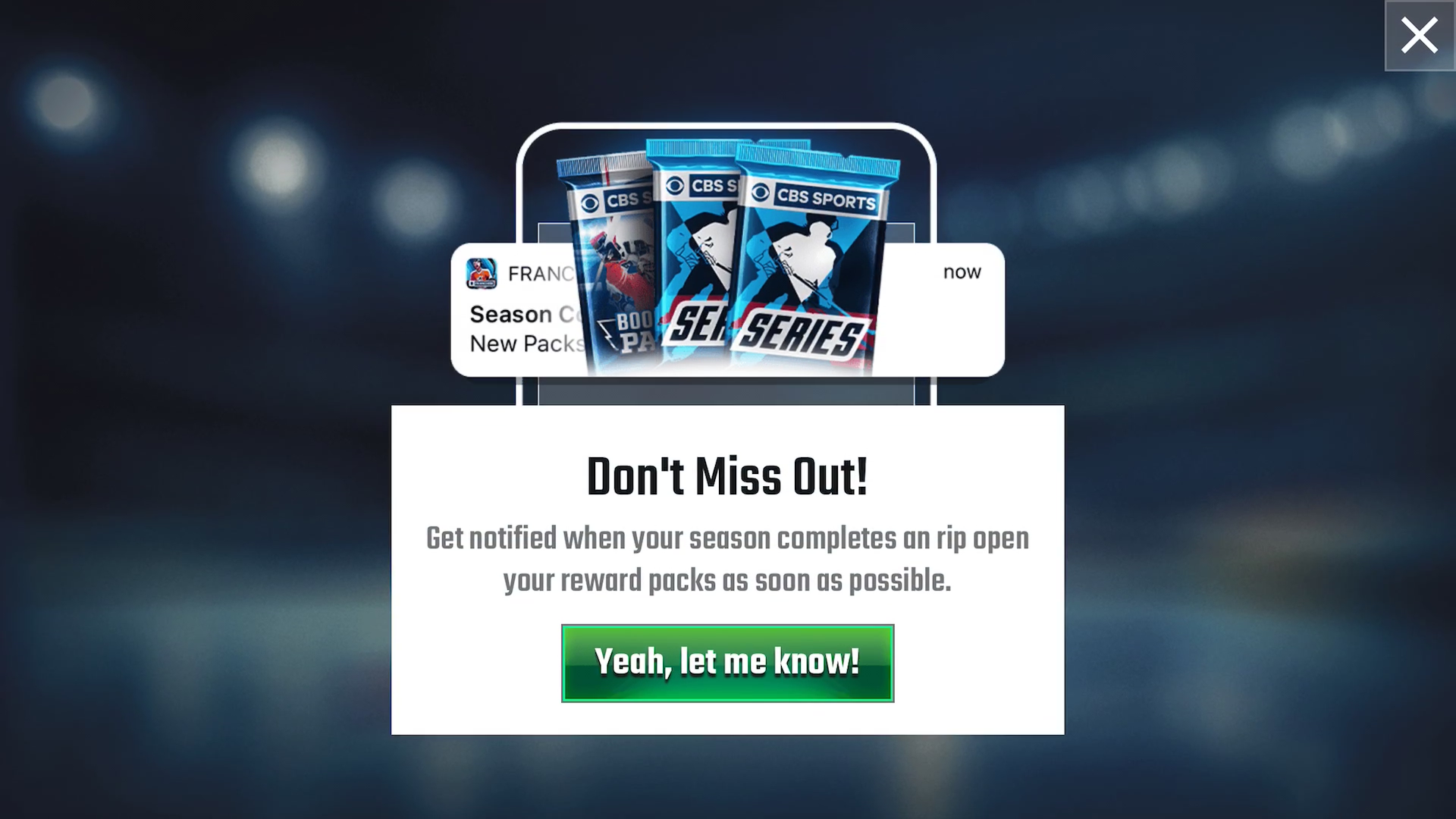
All elements of the landing view and modals were rebuilt using new visual styles and animation components that had been created for other features in the game, lending a more consistent feel.
The notification opt-in modal was also reposition after the user starts their season, using the season timer and rewards as the value proposition for notifications.
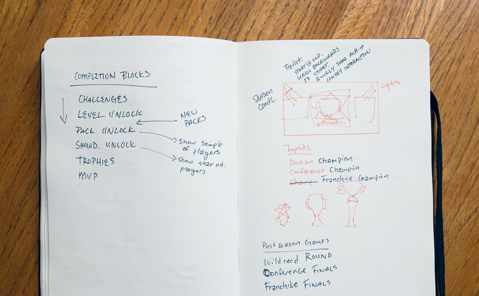
Previously, the season complete flow had been devoid of any information outside of the user's level change. Given how the season is core to progression in our game, this flow direly needed updating.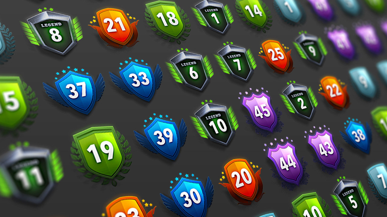
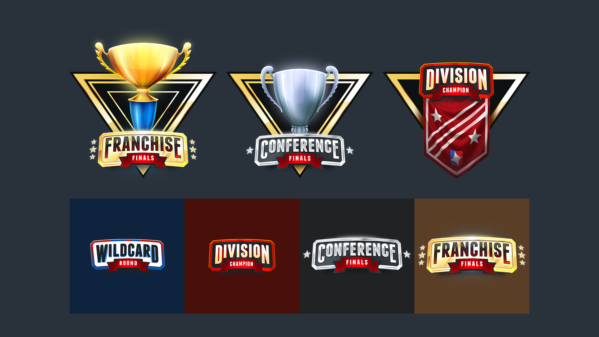
At completion, the user is now shown their performance, new level, and rewards, tying the start state with the completion state. Furthermore, extra feature unlocks are now displayed, as well as superficial accolades that bring attention to their season accomplishments.
